Shortcut to
Inclusion
I led this project end-to-end as the designer driving accessibility to the forefront of Doctolib Pro. This meant running cross-country user research, facilitating technical workshops with browser and Electron app teams to map safe implementation zones, establishing a scalable shortcut framework, and championing non-negotiable accessibility principles (including WCAG 2.1.4 and RGAA 4.1 compliance) against competing requests from power users and product teams. I also designed the discoverability system and the documentation framework that lets teams extend the system autonomously.
The Problem
Speed had been optimised for the mouse. Everyone else was left behind.
Healthcare professionals at Doctolib Pro worked in a mouse-heavy interface that imposed a hidden tax on anyone who couldn't (— )or preferred not to) navigate that way. Users relying on keyboard navigation, screen readers, or assistive input devices faced an experience that wasn't just inconvenient: it was exclusionary. At the same time, power users in Germany, many of them migrating from legacy clinical software with deeply ingrained keyboard-first habits, were losing significant time to unnecessary friction.
The result was a platform that served one type of user well and quietly failed everyone else. And as Doctolib accelerated its expansion into more markets and more complex clinical workflows, that failure was only going to grow.
"The interface wasn't keeping pace with how our users actually worked or needed to work. Keyboard navigation wasn't a feature request. It was an accessibility gap."
Internal product framingThe Initiative
Not a shortcut feature. An accessibility commitment.
This project was never just about adding keyboard shortcuts. It was about rethinking how Doctolib Pro respected the full range of its users: those with motor disabilities, those using screen readers, those with tremors for whom a single-key trigger could fire an action accidentally, and yes, those power users who simply expected more from their tools (about 60% of our German user base).
Core goals
- Achieve full WCAG 2.1.4 and RGAA 4.1 compliance, making keyboard navigation a first-class citizen across all platforms
- Design a conflict-free shortcut framework that would never break assistive technology or override standard navigation behaviors
- Bridge the cultural gap between French and German users without sacrificing inclusivity for either
- Build a scalable system, clear enough that other teams could extend it independently without creating chaos
Design Principles
Four commitments every shortcut had to honour.
Before designing any shortcut, I established four non-negotiable principles. These weren't guidelines, they were the decision-making compass for every technical and design trade-off we faced.
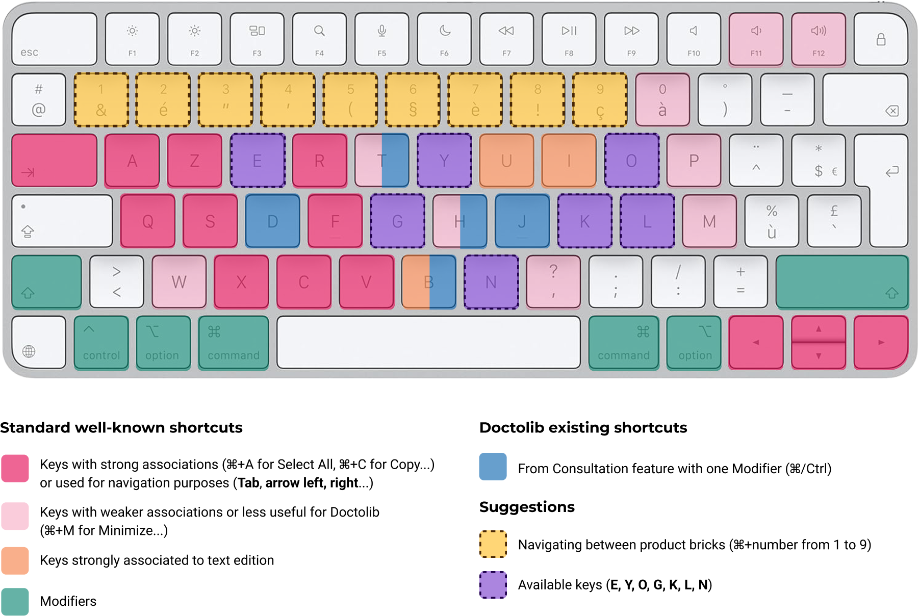
Shortcuts must never override system, browser, or assistive technology key bindings. For users who depend on tools like VoiceOver, NVDA, or JAWS, an unexpected key conflict isn't a minor annoyance, it's a broken experience. We mapped every shortcut against OS-level, browser-level, and screen reader defaults before making any implementation decision.
A shortcut that no one can find doesn't exist. Discoverability isn't a post-launch concern, it's a core accessibility requirement. Users with cognitive disabilities rely on consistent, visible affordances. We committed to showing shortcuts in the UI, in tooltips, and in a searchable help reference from day one.
Cognitive load is an accessibility concern too. Shortcuts that require arbitrary memorisation add friction, particularly for users managing complex clinical workflows. Every key combination was grounded in an intuitive relationship to its action, letters that echo the function, number sequences that mirror the visual tab order, modifiers that signal scope.
Each shortcut triggers one clearly defined action, with no exceptions. Ambiguity in key behavior is disorienting for all users, but especially for those navigating with assistive technology. Predictability is the foundation of trust and trust is what makes a keyboard-accessible interface actually usable.
The Framework
Three categories, one inclusive language.
Like any well-designed language, the system needed grammar and consistent rules users could internalise. I defined three shortcut categories with clear, distinct roles. Each layer was designed to serve a specific type of interaction while protecting the accessibility guarantees of the layers beneath it.
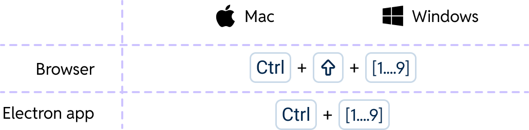
Standard navigation is non-negotiable. Tab, Shift+Tab, arrow keys, Enter, and Space always behave exactly as users — and their assistive technology — expect. These were never customisable, even when German users requested single-key overrides that would have broken screen reader compatibility.
On top of the baseline, we layered product-specific navigation shortcuts: Ctrl+1 through Ctrl+3 map directly to the visual tab order, making them instantly learnable. The number mirrors the position — no memorisation required.
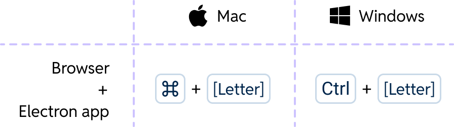
Global shortcuts trigger primary actions from anywhere in the product. By anchoring choices to established patterns — Cmd+K for search, as users already know from Slack and Notion — we reduced the cognitive cost of adoption. Familiar mental models lower barriers for all users, including those managing higher cognitive loads.
The list is deliberately limited. With a high risk of conflict against system-reserved combinations, each addition requires careful validation. Fewer globals means fewer surprises.

Local shortcuts are context-specific, active only in a defined workflow or page. The Alt/Option modifier signals "this works here, in this context" — a clear accessibility affordance that prevents accidental triggers for users who brush keys or have motor tremors. The scope boundary also means we can reuse the same letters across different contexts without any conflict.
One pilot learning: Ctrl+D was quietly overriding a browser behavior. We changed it to Alt+Q. The accessibility audit surfaced what user testing alone might have missed.
Navigating Constraints
Every constraint made the system more inclusive, not less.
The hardest moments in this project were when accessibility requirements and user requests pulled in opposite directions. In every case, holding the accessibility line produced better design.
Cmd+S and Ctrl+T are browser-reserved and cannot be overridden. Rather than fighting these constraints, we designed around them — choosing available modifier patterns that still felt natural. Working within the browser's model meant our shortcuts never surprised users navigating with keyboard-only workflows.Tab, Enter, arrows) retains full control. This was a firm architectural boundary: no shortcut should bypass or interrupt an accessible form interaction, which is itself a WCAG-defined interaction pattern.Research Foundation
Built on evidence, not assumptions about who our users were.
A quantitative survey run with cross-country researchers targeted current and potential shortcut users across France and Germany. The findings reshaped our understanding of the problem. German users' preference for simple single-key shortcuts turned out to be a habit, not an intrinsic need — and one that directly conflicted with accessibility standards. French users weren't opposed to shortcuts; they simply hadn't been shown them. Both insights pointed to the same solution: an accessible, discoverable system.
Discoverability
An accessible shortcut no one can find isn't accessible.
The German pilot revealed something important: users loved the shortcuts, but couldn't find them. Discoverability isn't an add-on — it's an integral part of accessibility. We designed three layers of visibility to make sure the system was learnable for everyone, regardless of how they encountered it.
Shortcuts are displayed directly next to button labels and actions throughout the interface. Users discover them passively, in the flow of their normal work — no documentation hunt required. Visible affordances are a WCAG accessibility requirement, not a nice-to-have.
A complete, searchable, categorised reference for every shortcut in the system. Structured by the three categories so users can build their mental model progressively. Designed to be screen reader accessible, with proper heading hierarchy and keyboard-navigable tables.
Clear guidelines for how teams add new shortcuts: which category they belong to, how to validate for conflicts, what documentation is required before shipping. This ensures the accessibility guarantees hold as the system grows — no team can accidentally break the framework by going rogue.
Impact
An inclusive system that no one had to compromise for.
Ctrl+D → Alt+Q) was made proactively after pilot feedback revealed a browser override — before any user was harmed.The most lasting outcome isn't in the metrics. It's that inclusivity and efficiency were never in opposition. The same framework that satisfied screen reader users also satisfied German power users and French newcomers — because good accessibility design is, ultimately, good design for everyone.